I built a design-aware analytics system to understand how email layout decisions influence revenue — and to guide future campaign strategy.
Design → KPI causality
Visual analytics
Decision support for marketers
Core Question
Which email layout patterns consistently outperform — and how can future campaigns be designed with data-backed confidence?
Linking Layouts to Performance: Structuring the Data for Insight
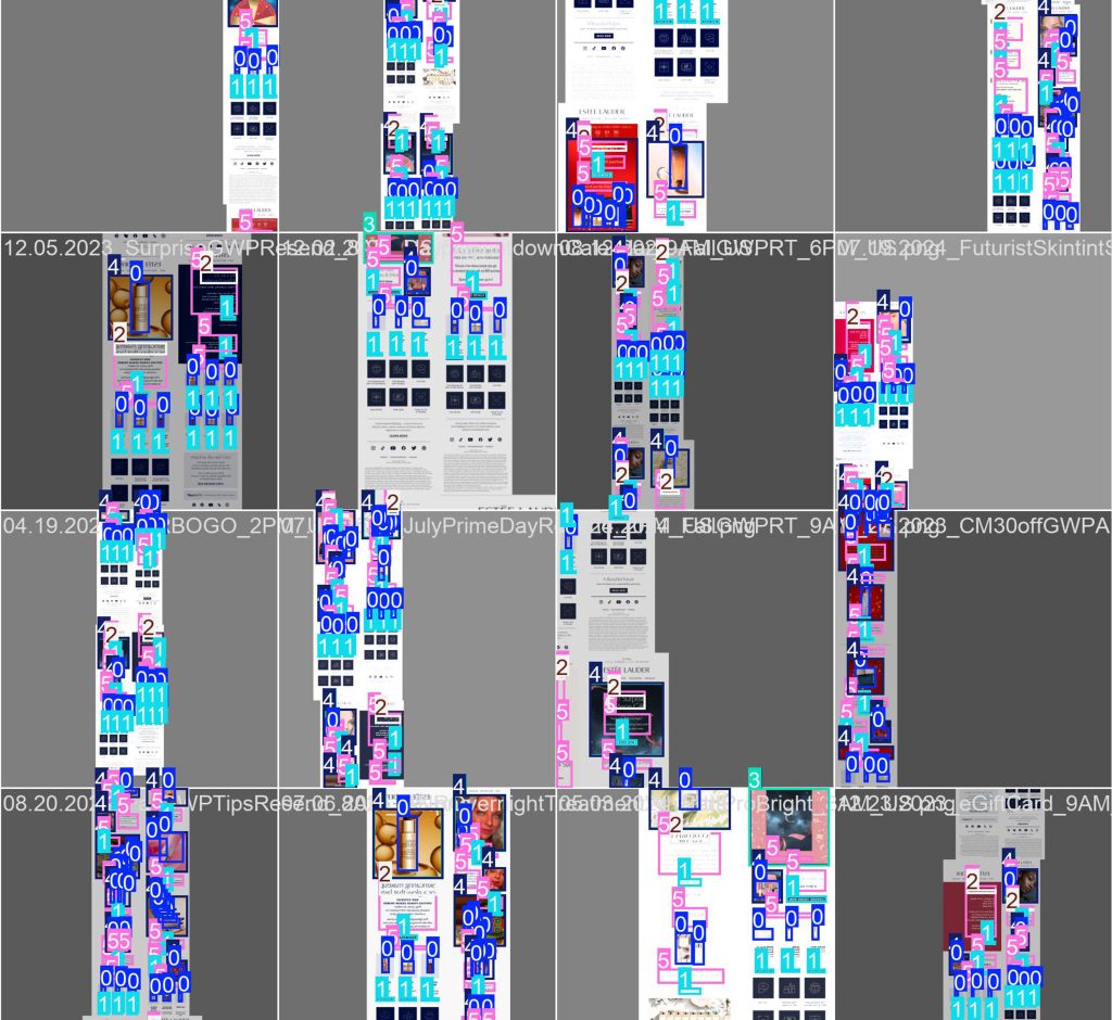
The next step involved processing KPI-rich Excel documents and programmatically linking each email image to its corresponding data row using Python. This ensured that every visual layout was accurately matched with performance metrics like revenue, click-through rate, and conversion. To enable deeper pattern recognition, emails were also categorized into three types for analysis:
Regular Emails – Standard brand messaging and product spotlights sent on a consistent cadence
Holiday Emails – Featuring seasonal design themes and time-sensitive offers
Promotional Emails – Focused on product discounts, bundles, or special incentives
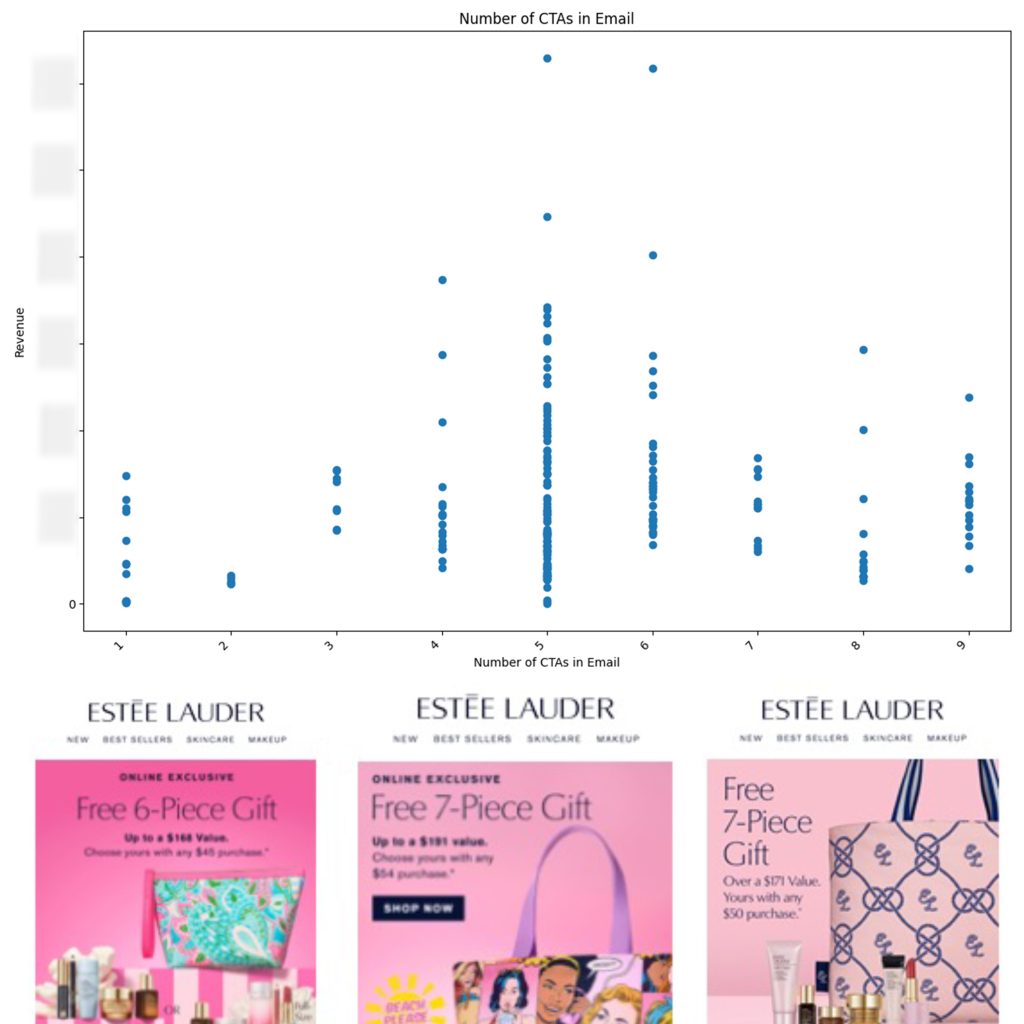
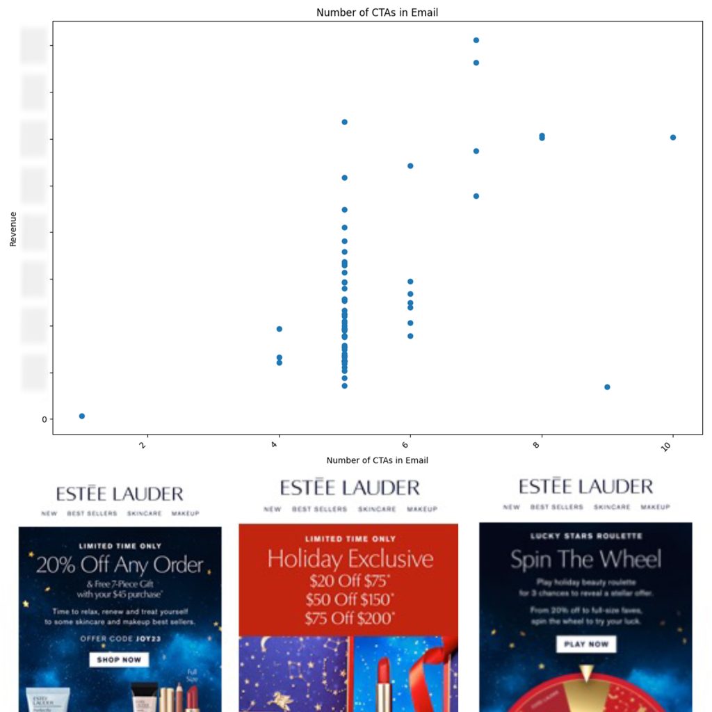
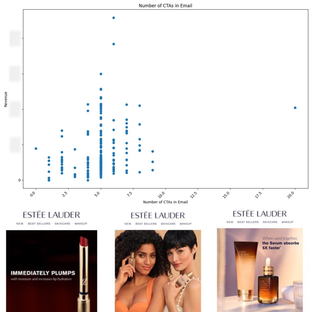
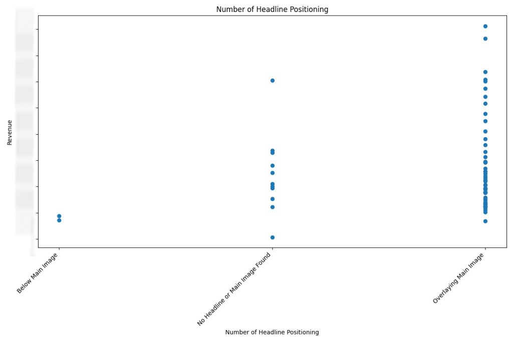
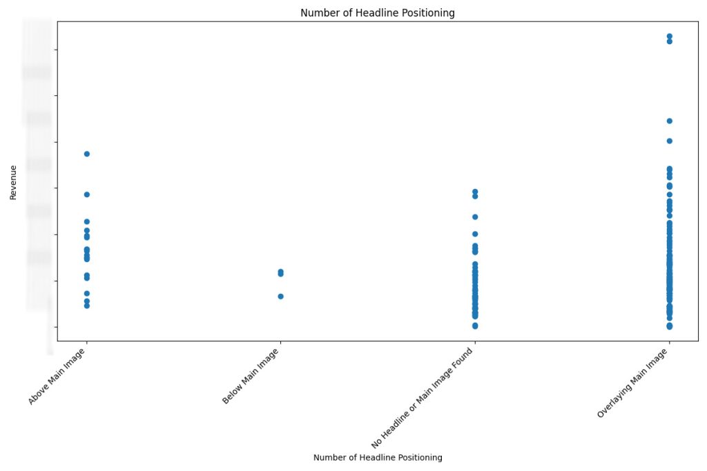
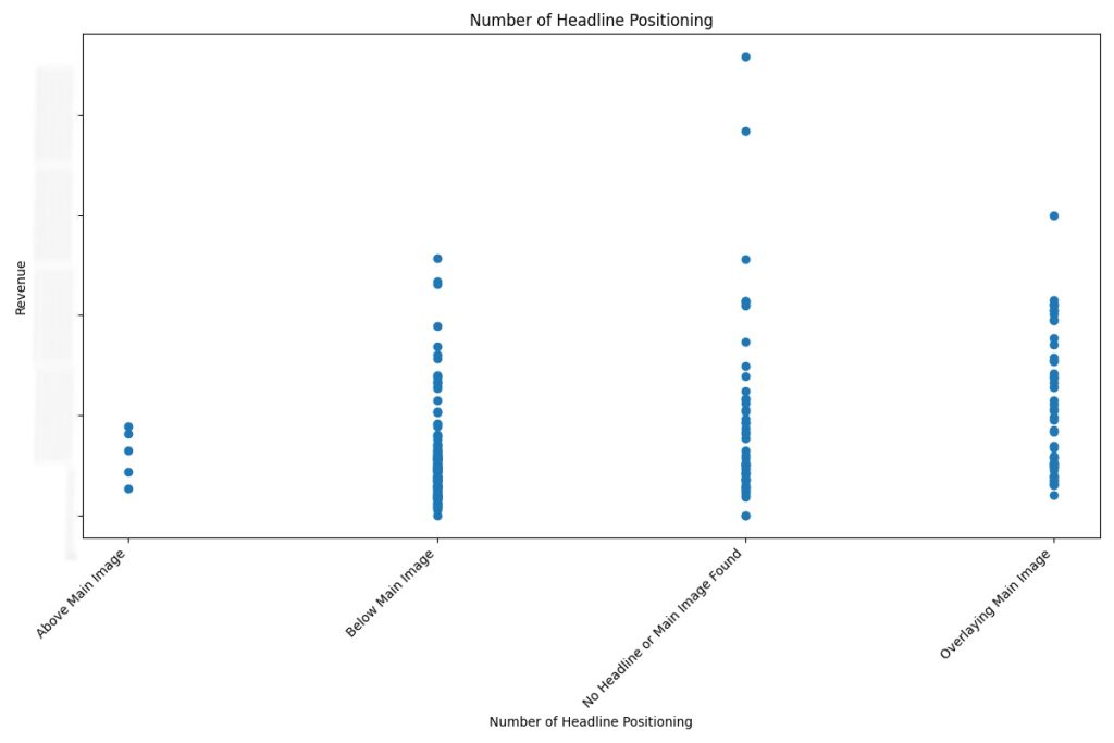
Example: Headline Positioning VS Revenue
One standout insight from the analysis was the influence of headline positioning on revenue performance. Across all three email categories—Holiday, Promotional, and Regular—emails that featured headlines overlaid directly onto imagery consistently drove higher revenue compared to those with headlines placed above or below. This suggests that integrated visual messaging may better capture attention and improve engagement, especially when aligned with strong creative.
Insight 1:
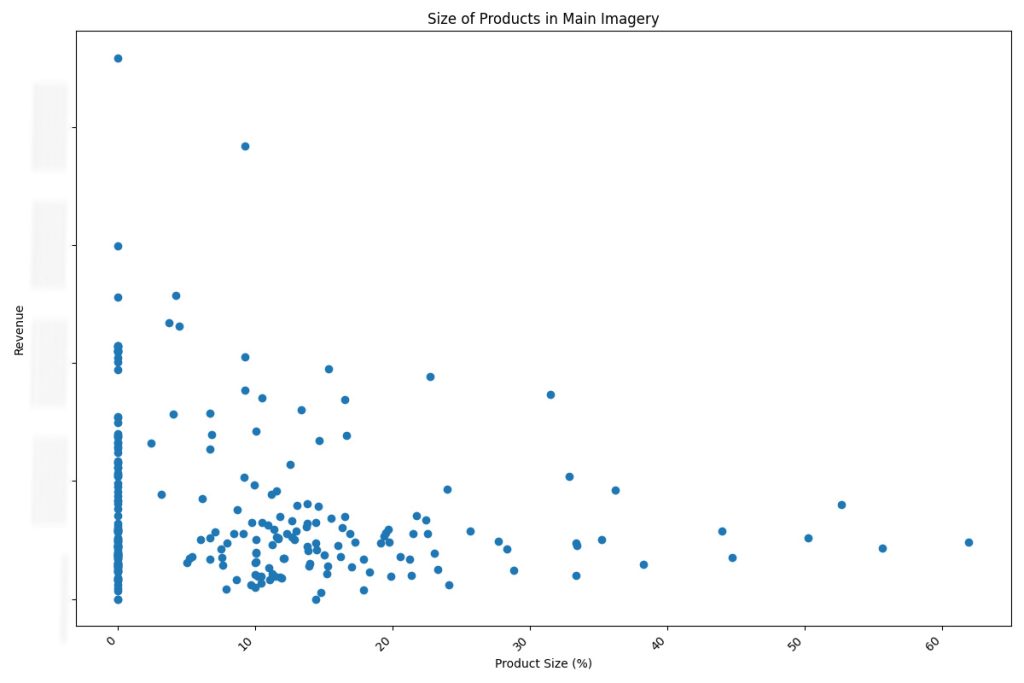
Bigger Product Visuals Drive Revenue in Regular Emails
In Regular Emails, a clear trend emerged: the larger the main product image, the higher the associated revenue. Emails with bold, oversized product visuals outperformed those with smaller or more evenly spaced layouts. This suggests that emphasizing a hero product in Regular Emails helps focus attention and drive purchase intent.
Insight 2:
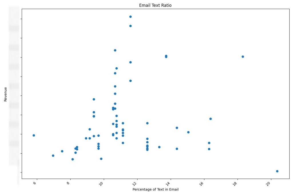
The Text-to-Image Sweet Spot for Maximizing Revenue
Emails performed best when text occupied between 10% to 13% of the total layout area. Falling outside this range—whether too text-heavy or too sparse—was consistently linked to lower revenue. This finding highlights the importance of visual balance, where clear messaging complements, rather than overwhelms, the creative.
Turning Insights into Action: Integrating Data into the Creative Workflow
The correlations uncovered through this analysis are now a core part of the monthly email production process. I present key findings during monthly planning meetings, using visualizations and performance summaries to guide the marketing and design teams toward layout decisions backed by data. These insights help shape story concepts, influence creative direction, and ensure that each email design is strategically aligned with revenue-driving patterns.