Designing Clarity: E-commerce Churn Dashboard for Apteo
While working as a UI/UX designer at Apteo, I led the design of this customer churn analytics dashboard to help e-commerce clients visualize and act on user retention data. The interface breaks down churn risk levels, highlights key behavioral drivers, and segments users into cohorts for targeted analysis. Our goal was to empower non-technical users to quickly interpret complex metrics and make informed decisions to reduce churn.
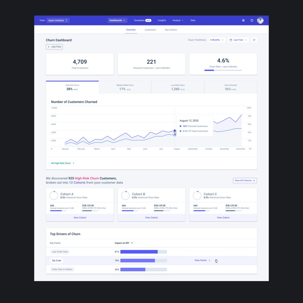
Clean, Actionable, and Insight-Driven Dashboard Design
The dashboard was designed with a focus on clarity, hierarchy, and usability. Key metrics like total churn, churn rate, and high-risk segments are prominently displayed at the top for instant visibility. Below, an interactive timeline visualizes customer churn trends over time, while modular cohort cards and churn driver bars allow for quick exploration of user behavior. The layout uses a clean, modern aesthetic with balanced spacing and a soft color palette to make complex data approachable and easy to act on.
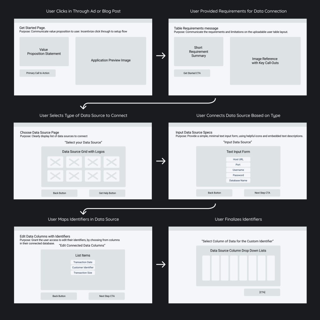
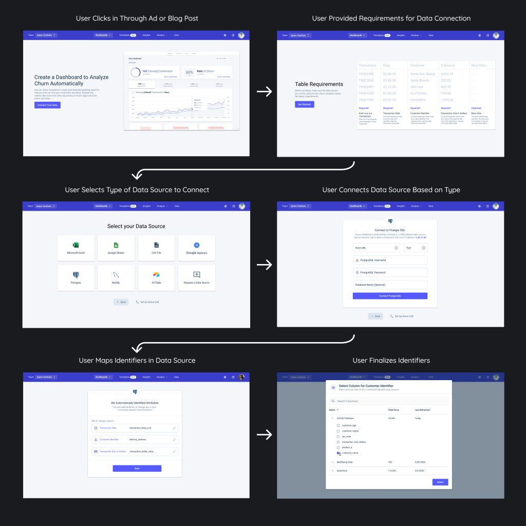
Streamlining Onboarding: From Wireframes to Live Product
To support first-time users in connecting their data sources quickly and confidently, I designed a full onboarding flow from low-fidelity wireframes to high-fidelity UI screens. The flow walks users through selecting a data source, inputting connection credentials, and mapping relevant data columns—all while keeping the experience visually clean and purpose-driven. Each step was designed to reduce friction, with contextual guidance, embedded validation, and smart defaults that help users stay on track from setup to insight.
From Concept to Clarity: Designing the Churn Analytics Dashboard
These wireframes and final designs illustrate the evolution of Apteo’s churn analytics dashboard, built to give e-commerce teams actionable insights into customer retention. Starting from a modular wireframe structure, I mapped out a clean, intuitive hierarchy—leading with high-level KPIs, followed by interactive churn trend graphs, cohort breakdowns, and top contributing factors. The final UI delivers a visually cohesive and information-dense experience that makes complex churn data both accessible and actionable for teams across marketing and operations.
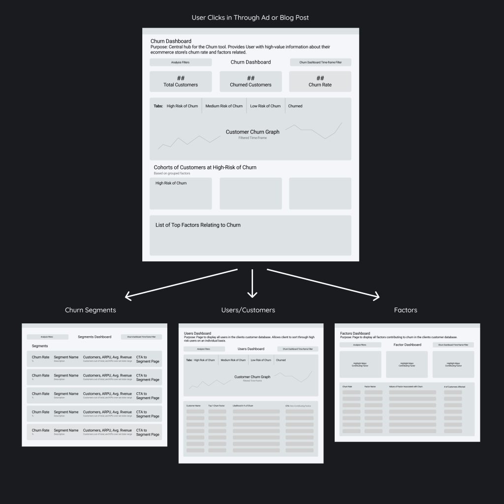

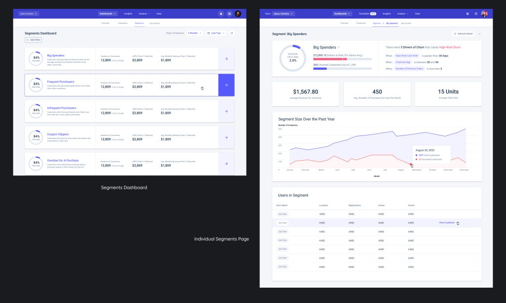
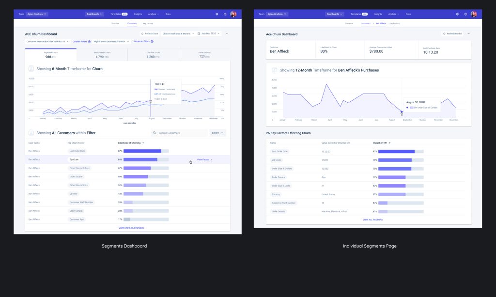
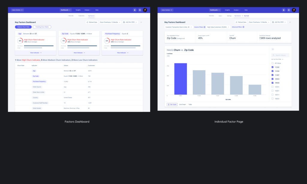
Segment, Customer, and Churn Factor Dashboards
To support deeper exploration beyond the main dashboard, I designed dedicated pages for Churn Segments, Individual Customers, and Churn Factors. The Segments Page allows users to view and compare performance across custom-defined user groups, each with unique churn rates and average revenue. The Customers Page provides a searchable, filterable view of individual user data, including behavior over time and risk level. The Churn Factors Page highlights the key variables influencing churn, ranked by impact on performance KPIs—giving teams a data-backed starting point for strategic retention efforts. Each page maintains a consistent visual language to ensure a seamless analytical workflow.
Empowering Smarter Retention Through Design
This project reflects the power of design in translating complex data into meaningful, actionable insights. By collaborating closely with data scientists and product managers, I helped build an experience that not only visualizes churn but enables teams to understand, segment, and act on it. The end result is a scalable analytics platform that puts clarity, usability, and business impact at the forefront of the user experience.